Table of Contents
ToggleWhen you’re locked into a chaotic teamfight in Overwatch 2, split-second decisions determine victory. Your eyes dart across the screen, scanning for threats, tracking cooldowns, spotting teammates across the map. That’s where Overwatch icons become your silent ally. These visual markers represent far more than aesthetic polish: they’re the backbone of situational awareness in competitive play. Whether you’re a casual player climbing the ranks or an esports enthusiast studying pro VODs, understanding how icons function can transform your gameplay from good to genuinely competitive. This guide breaks down everything you need to know about Overwatch icons, from hero recognition to advanced icon strategy, to help you read the battlefield faster and make smarter decisions.
Key Takeaways
- Overwatch icons are the visual foundation of competitive gameplay, enabling instant hero recognition and split-second decision-making during chaotic teamfights.
- Mastering ability icon cooldown states and ultimate charge tracking directly separates casual players from competitive climbers by improving positioning and team economy.
- Customizing your HUD settings—including Overwatch icon size, opacity, and scoreboard positioning—significantly enhances recognition speed and reduces cognitive load during intense matches.
- Professional players leverage advanced icon strategy by reading enemy ultimate charge, predicting hero switches, and adapting positioning based on visible cooldown states.
- Overwatch’s accessibility features, including colorblind modes and high-contrast settings, ensure all players can achieve competitive performance through clear icon distinction.
- Consistent practice with hero recognition, ability tracking, and ultimate economy monitoring transforms icon reading from conscious effort into automatic pattern recognition that compounds your ranking climb.
What Are Overwatch Icons and Why They Matter
Overwatch icons are visual representations that identify heroes, abilities, ultimate charge states, and gameplay elements throughout the user interface and in-game world. They’re not just pretty graphics, they’re the language Overwatch uses to communicate information instantly.
Think of icons as a communication protocol. Instead of reading text that says “Tracer has landed behind our team,” your brain processes her distinctive icon and the knowledge hits instantly. Professional players and veteran gamers don’t consciously read icons: their pattern recognition has made the process automatic. Newer players, meanwhile, often miss crucial information because they haven’t yet internalized what each icon means.
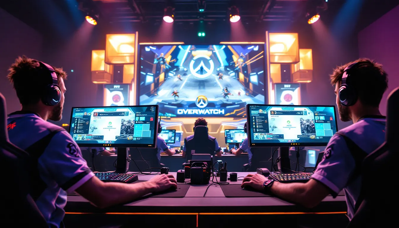
The importance of icon clarity extends beyond personal skill. Teams operating at the highest levels of Overwatch esports, competing in tournaments and climbing T500 ladder play, rely on consistent icon recognition to coordinate ultimate economy, track enemy cooldowns, and position strategically. When you know instantly that Zenyatta’s discord orb is active because of a visual indicator, you’re making better mechanical decisions.
Overwatch icons also reduce cognitive load. Your brain can process visual symbols faster than text. A small icon communicating that Widowmaker’s grappling hook is on cooldown takes microseconds to register: reading out “Widowmaker’s ability is unavailable for 8 seconds” would steal focus from gameplay. This is why icon design has been refined constantly since Overwatch’s 2016 launch.
The Role of Hero Icons in Gameplay and Strategy
Quick Enemy Recognition During Combat
You’re on Lijiang Tower, defending Point A. Suddenly, you see an enemy hero icon approaching from the attacker spawn. Your brain instantly registers the icon shape, color, and position, and you know exactly who’s coming. Is it Winston (high priority threat for your backline)? Soldier: 76 (demands positioning respect)? Or Mercy (different tactical response needed)?
Fast enemy recognition directly correlates to better decision-making. During the opening engage, spotting which heroes the enemy fielded gives your team crucial information. In pro play, teams dedicate specific roles to shot-calling, communicators who track enemy positioning and relay information. But without consistent icon recognition from all players, calls become sluggish and imprecise.
Hero icons appear in multiple places: above enemy heads in the 3D world, on the scoreboard, in kill feed, and on your HUD. Each placement serves a purpose. The icon hovering above an enemy’s head tells you their current position: the icon on the scoreboard persists even when they’re behind cover. Learning to scan these different locations, and understanding which information each provides, is foundational.
Ability Icon Recognition and Cooldown Management
Managing ability cooldowns separates casual players from competitive ones. Overwatch displays ability icons with visual indicators showing cooldown status. A greyed-out icon means the ability is unavailable: a colored icon with a timer arc means you’re waiting for the ability to come back online.
This matters intensely in team positioning and ult economy. If you know Lucio’s defensive abilities are on cooldown for another three seconds, you adjust your positioning to account for reduced defensive utility. If you see that D.Va’s Defense Matrix just came back online, you change your engage angle or timing. Professional players track these details subconsciously, glancing at ability icons dozens of times per match.
Ability icons also communicate to teammates. When your Reinhardt sees your Roadhog’s hook on cooldown, he knows the team’s hook availability is limited for the next 8 seconds. This cascades into better ultimate economy decisions and positioning choices.
Map Markers and Team Communication Icons
Beyond hero and ability icons, Overwatch uses tactical icons for map markers, ultimate status, and communication. When a teammate places a marker on the map, everyone sees a distinct icon at that location. Ultimate charge indicators, displayed as icons next to player names, tell you exactly how close your team is to critical ult thresholds.
Team communication icons have become more sophisticated over Overwatch 2’s evolution. Knowing at a glance which teammates have ult available, which are dead, and which are at critical health helps you make macro positioning decisions. Watching the ultimate icons fill on your scoreboard is watching the game’s momentum shift in real-time.
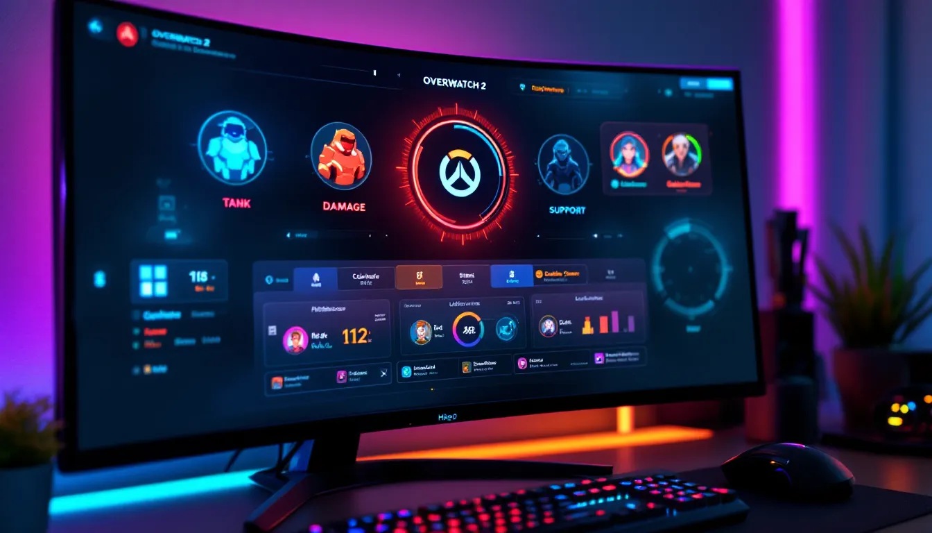
Complete Guide to All Overwatch Hero Icons
Tank Hero Icons and Identification
Tank heroes form the frontline, and their icons are designed to be immediately recognizable even in chaotic fights. Each tank icon carries visual weight, larger, bolder designs that pop on screen.
Reinhardt displays a large shield icon, reflecting his primary identity as a barrier tank. D.Va’s icon features her mech suit, instantly communicating her mechanical nature. Junker Queen has an aggressive, tribal-influenced icon design. Sigma uses a geometric, otherworldly icon befitting his reality-bending abilities. Wrecking Ball shows the hamster in his mech ball. Zarya features a clean, athletic design. Mauga displays tribal markings reflecting his background.
Recognizing tank icons matters because your engagement strategy shifts based on which tank opposes you. Facing Reinhardt demands different positioning than facing Sigma. Your ability selections, timing, and ult priorities change. Professional teams analyze enemy tank picks during hero selection because it dictates defensive positioning for the entire team.
Damage Hero Icons and Recognition
Damage heroes have the most variety. Their icons range from sleek to stylized, reflecting each hero’s unique personality and playstyle.
Tracer’s icon shows her aggressive, dynamic design. Genji’s icon features his katana and ninja aesthetic. Widowmaker’s uses her distinctive silhouette and crosshair. Junkrat’s icon is chaotic and explosive. Symmetra’s emphasizes her architectural, precise nature. Bastion shows the character with their robotic companion. Sombra’s icon reflects her stealthy, hacker identity. Soldier: 76 uses a militaristic aesthetic. Reaper’s icon carries dark, menacing design. Pharah features her rocket launcher and winged motif. Cassidy (formerly McCree) has a western gunslinger aesthetic. Sojourn displays her railgun and athletic frame. Torbjorn shows his turret and engineering tools.
Damage icons require the fastest recognition because you’re constantly assessing threat priority. If you see a Widowmaker icon on the enemy team, sightline placement becomes critical. If you spot Pharah, you know you need teammates with hitscan capability.
Interestingly, Overwatch player icons carry the same design language. Your overwatch player icons in competitive modes follow consistent visual rules, making teams instantly identifiable even when customized.
Support Hero Icons and Positioning
Support hero icons are often more gentle in design, though no less distinctive. These icons help teams track healing availability and defensive utility.
Mercy’s icon features her staff and angelic design. Lucio’s uses sound wave imagery reflecting his music-based abilities. Ana’s icon shows her distinctive eye patch and weapon. Zenyatta’s shows his meditative, orb-based aesthetic. Brigitte’s features her armor and weapon. Lifeweaver’s icon reflects his plant-based, nature-focused abilities. Kiriko’s uses Japanese spiritual design elements.
Support icons matter for different reasons than damage or tank icons. You’re tracking healing availability, positioning for protection, and managing ult cycles. Seeing that the enemy has both Ana and Zenyatta (both defensive supports with strong ult abilities) changes how your team engages.
Customizing Your Icon Display Settings
HUD Customization Options
Overwatch provides extensive HUD customization to help you optimize icon visibility and layout. Different players have different preferences based on their role, monitor size, and visual acuity.
You can adjust:
- Icon size – Larger icons are easier to spot during intense fights, especially on larger monitors or at distance
- Icon opacity – Reducing opacity on certain elements prevents visual clutter
- HUD scale – Adjusts the overall size of all interface elements proportionally
- Scoreboard positioning – Move the scoreboard to a location that doesn’t block your preferred crosshair or engagement area
- Ultimate status display – Choose how prominently ultimate charge indicators appear
Professional players and content creators spend considerable time optimizing these settings. Watch any Overwatch esports coverage from Dexerto and you’ll notice pros use highly personalized HUD layouts. Some prefer minimal HUD to reduce visual clutter: others maximize information density.
Your role influences optimal settings. Hitscan players (Soldier: 76, Widowmaker) often prefer larger crosshairs with minimized peripheral HUD elements. Supports might prefer larger teammate icons and health indication. Tanks benefit from clear barrier/cooldown indicators.
Accessibility Features for Icon Clarity
Overwatch has implemented several accessibility features specifically to improve icon recognition for players with visual impairments or colorblindness.
Colorblind modes include multiple options:
- Deuteranopia (red-green colorblindness)
- Protanopia (different red-green variation)
- Tritanopia (blue-yellow colorblindness)
- Monochromacy (complete colorblindness)
These modes recolor icons throughout the interface to maximize contrast and distinction for affected players. This isn’t a minor feature, colorblindness affects roughly 8% of males and a smaller percentage of females. The competitive scene includes colorblind players, and these settings allow them to perform at the highest levels.
Beyond colorblind modes, you can adjust contrast and enable icon outlines that make elements pop more distinctly. Some players find that enabling high-contrast mode helps during late-night gaming when visual fatigue sets in.
Icon customization extends to personal preference. The ability to shape your HUD means your icon setup can match your gameplay needs, positioning, and visual preferences. This individualization has contributed to Overwatch’s accessibility reputation, it’s a competitive game that doesn’t exclude players with different visual needs.
Advanced Icon Strategy: Reading Enemy Lineups and Adapting
Once you’ve mastered basic icon recognition, advanced players leverage icons for strategic analysis and real-time adaptation.
Reading ultimate charge from icons tells you when enemy ults are coming online. If you see the enemy Tracer’s ultimate is nearly full while your own ultimate economy is dormant, you know an aggressive play is incoming. Top players constantly monitor these icons to predict enemy actions before they happen.
Icon positioning in death cam provides valuable information. After you die, watching the death cam shows where enemies were positioned relative to their icon positions. This teaches you threat assessment, how far out was that Widowmaker? Where was the Lucio positioned relative to the frontline? Building this spatial awareness from death cams directly improves your own positioning next fight.
Team coordination through icons reaches peak efficiency at competitive levels. When a shot-caller tells the team “their support ults are up,” the information is already visible on every player’s screen. The communication emphasizes priority and timing rather than sharing information. The icons provide baseline data: communication layered on top coordinates action.
Predicting hero switches also relies on icon reading. If you notice the enemy’s DPS player repeatedly peeks but hasn’t secured kills, you might predict a hero swap before it happens based on patterns you’ve observed through their icon positioning and timing.
The most advanced players incorporate all this information into subconscious decision-making. They’re not thinking “I see the icon, hence I adjust position.” The process is automatic, freeing mental bandwidth for higher-level strategy and mechanical execution.
Icon Evolution: How Overwatch Has Redesigned Hero Visuals
Overwatch icons haven’t remained static since launch in 2016. The game has undergone significant icon redesigns, rebalancing and visual refinements to improve clarity and consistency.
Early icon designs sometimes lacked distinction. Several heroes had similar visual silhouettes that newer players struggled to differentiate during fast-paced gameplay. The original Overwatch team recognized this and began iterative refinements.
Overwatch 2’s visual update (2022) brought comprehensive icon modernization. Icons became clearer, more vibrant, and better optimized for the new game’s pace. Hero icon designs were flattened for clarity while maintaining distinctive character. The shift toward simpler, cleaner icons reduced visual noise during intense fights.
New hero additions follow modern icon design principles established over Overwatch 2’s evolution. When Overwatch Updates introduce new heroes, their icons integrate seamlessly with the existing visual language while remaining instantly distinctive.
Cosmetic implications matter here too. When players purchase skins, the hero icons adjust to reflect the cosmetic variant. Watching the scoreboard shows teammates’ current cosmetic choices through their icons. This has become its own form of communication, teammates instantly recognize each other through customized icon appearances.
Competitive integrity drives many icon refinements. Blizzard continuously evaluates whether any icon designs create visual confusion at professional levels. If pros struggle to distinguish two heroes instantly, the design likely changes. This commitment to clarity has kept competitive Overwatch accessible and fair.
Recent patches through 2025-2026 have focused on ensuring new hero releases integrate clearly into existing icon architecture. The design team understands that poor icon design directly degrades gameplay quality for all skill levels.
Common Icon Recognition Mistakes New Players Make
New players often struggle with icon recognition, and certain mistakes appear repeatedly. Understanding common pitfalls helps you avoid them.
Confusing similar silhouettes is the most frequent error. Reinhardt and Junker Queen share some visual weight. Sigma and Symmetra both have geometric designs. Genji and Sombra have similar sleek profiles. Newer players often squint at the scoreboard trying to distinguish them during crucial moments. The solution is drilling recognition through experience, watching pro streams, reviewing replay footage, and playing regular matches until recognition becomes automatic.
Missing ability icon cooldown states happens when players fixate on hero icons and ignore ability status. You might notice an enemy Ana, but miss that her sleep dart is on cooldown for another 6 seconds. This is a fundamental scan practice issue, your eyes need to track multiple icon layers simultaneously.
Ignoring ultimate charge indicators represents a strategic mistake rather than pure recognition issue. Casual players sometimes overlook ult icons entirely, making suboptimal engagement decisions based on incomplete information.
Failing to recognize cosmetic variations occurs when teammates purchase rare skins. Your brain expects the standard icon appearance, and cosmetic variants sometimes throw you off. Experienced teams account for this by learning teammate skins during warmup.
Not customizing HUD for personal needs leaves performance on the table. Some players struggle with default icon sizes or positions but never adjust settings. Spending 10 minutes optimizing your HUD can provide noticeable improvements in icon recognition speed.
Tunnel vision on one icon is a higher-level mistake, fixating on one enemy or threat while missing other important icons. Pro players train themselves to glance broadly across icons rather than focusing on single elements.
The path to mastery is straightforward: start with basic hero recognition, layer in ability icon awareness, then expand to ultimate economy and team positioning through icons. Each skill builds naturally on the previous level.
Conclusion
Overwatch icons are far more than decorative elements, they’re the visual framework that enables fast decision-making at competitive levels. From instant enemy recognition to ultimate economy tracking to accessibility-first design, icons represent Blizzard’s commitment to clarity and fairness.
Mastering icon recognition separates casual play from competitive climb. Whether you’re tracking Overwatch scoreboard features for stat analysis or reading enemy lineups during intense fights, strong icon literacy directly elevates your gameplay.
Start with basic hero recognition, practice ability icon tracking, then expand into advanced strategies like ultimate economy prediction and enemy adaptation. Customize your HUD settings for personal optimization, and don’t overlook accessibility features that can improve visibility during intense sessions.
The next time you queue into competitive play, notice how your eyes move across icons. With deliberate practice, that scanning becomes automatic, freeing mental bandwidth for the strategic depth that makes Overwatch endlessly compelling. Your icon mastery will compound session after session, climbing with you toward higher ranks and sharper competitive understanding.